flex-basis、flex-grow、flex-shrink
flex-basis、flex-grow、flex-shrink这三个属性决定了flex item的展示尺寸- 要想了解三者是如何决定
flex item的尺寸前,先要了解一下max-content、min-content、正负向自由空间概念 - 注意以下的讨论都是在主轴为横轴基础上讨论的
min-content、max-content
- 这两个都是用来设置
width的 - 通过下面的例子,我们就知道他们是什么含义
1 | <!DOCTYPE html> |
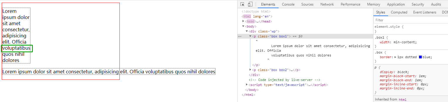
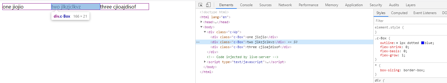
- mix-max-contet.png
- 可以看到
box1的width设置了min-content后,它抓住了一切机会来换行,直到出现一个最大的无法换行的单词才停止,就如截图中的voluptatibus单词- 也就是说
min-content的宽度是由最长不可换行单词决定的
- 也就是说
- 而设置了
max-contet的box2却有截然相反的表现,它尽可能的不换行,就跟我们设置了white-space:no-wrap;的表现很类似,即使外层.wp设置了固定尺寸,它也会冲破限制,溢出了max-content确定的宽度是内容正常展示时的最大宽度
min-content、max-content在flex布局中有关键作用,下面会做讲解
正负向自由空间
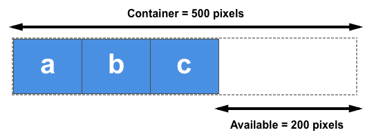
正向自由空间 positive free space
- 正向自由空间描述的是
flex布局时,flex container剩余的空间 - positive-free-space.png
- 在
flex布局中,当flex container宽为500px,内部有三个100px初始宽度的flex item,那么剩下的200px就是正向自由空间,这200px的宽度后续将交给flex-grow按照一定的策略来分配
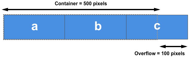
负向自由空间 negative free space
- 负向自由空间其实是一个和正向类似的概念
- 它描述的是
所有flex item宽度和超出flex container的部分 - negative-free-space.png
flex container仍然是500px,但三个flex item初始宽度变为200px了,他们宽度总和超出flex container 100px,这个100px就为负向自由空间,这100px的宽度后续将交给flex-shrink按照一定策略来缩减(消化),让其三者宽度总和不超过500px
注意
- 正负向自由空间都是
flex-grow、flex-shrink参与空间分配前的概念,当这两个属性参与空间分配后,其实这个空间就可以视为不存在了
flex-basis
flex-basis是flex布局的基础flex-basis决定了flex item在主轴上的初始尺寸- 初始尺寸用来计算正、负向空间
- 正、负空间决定了
flex-grow和flex-shrink哪个生效
取值
auto- 默认值
- 如果设置了
width,则使用width值做为初始尺寸,否则使用max-content(最大内容宽度)做为初始尺寸
content- 不管有没有设置
width,都使用我的max-content(最大内容宽度)做为初始尺寸 - 存在兼容问题
- flex-basis-content.png
- 不管有没有设置
非0数值10px10%10em- 将对应数值的计算值做初始尺寸
0- 初始尺寸为 0,代表当前
flex item不参与正、负空间计算
- 初始尺寸为 0,代表当前
例子
- 由于
content存在兼容问题,所以没举content的例子
1 | <!DOCTYPE html> |
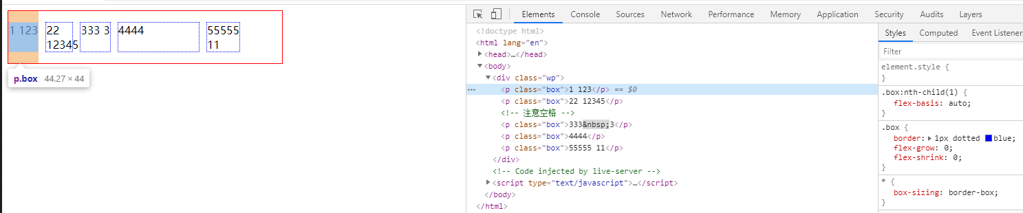
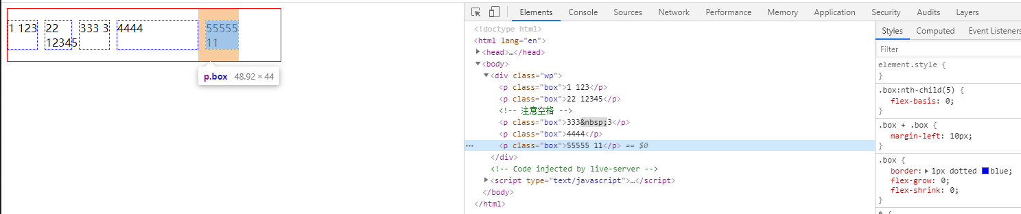
- 第一个盒子
- example-1.png
flex-basis为auto,又没设置width,所以最终尺寸为max-content
- example-1.png
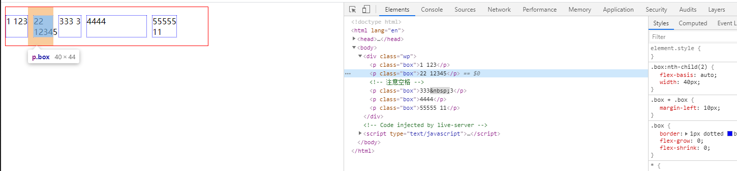
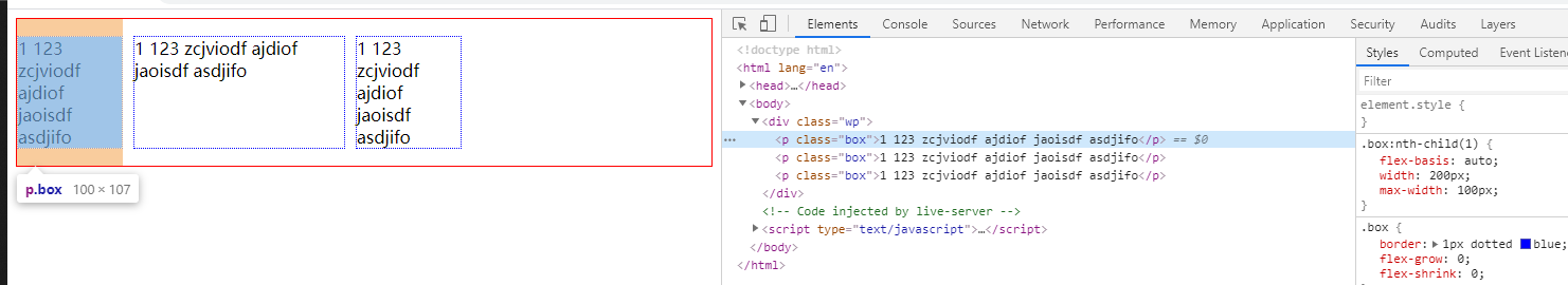
- 第二个盒子
- example-2.png
- 设置
auto又设置了width,所以取width宽度40px- 注意这里虽然
min-content>width,但是最终尺寸仍然是width:40px(导致产生溢出) - 所以当
flex-basis指定auto同时又设置width时,最终尺寸将不受min-content影响
- 注意这里虽然
- example-2.png
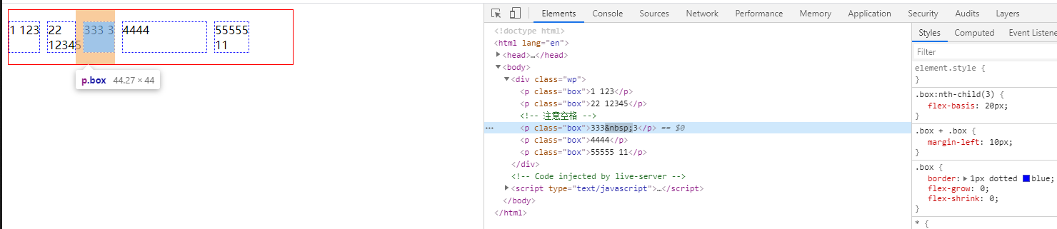
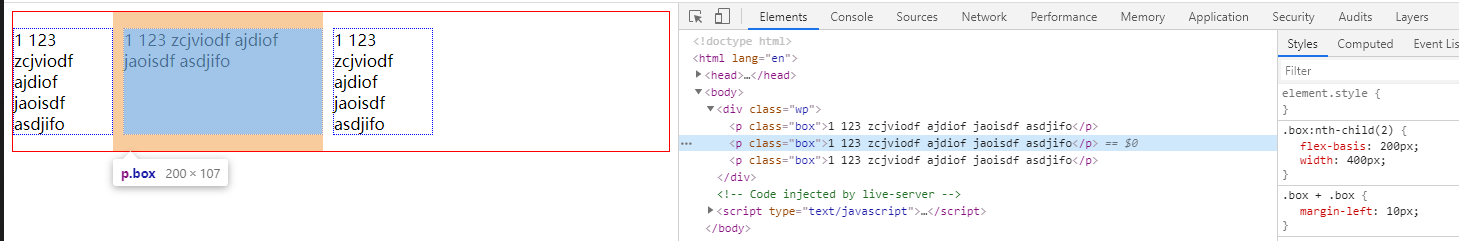
- 第三个盒子
- example-3.png
- 虽然设置了
flex-basis:20px;,但由于min-content为30px,所以最终的大小为30px
- example-3.png
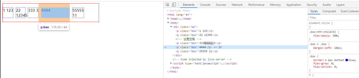
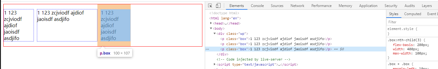
- 第四个盒子
- example-4.png
30%为120px,而且min-content<120px,所以最终尺寸为120px
- example-4.png
- 第五个盒子
- example-5.png
flex-basis为0,不参与空间计算,所以最终尺寸为min-content
- example-5.png
width、flex-basis、min-width、max-width 关系
- 记住公式
- 优先级
flex-basis>width>min|max-content- 最终展示的大小会受
max|min-width限制 - 同时设置上述属性并且
flex-basis不为auto时flex-basis会覆盖(忽略)width值进行布局,flex-item最终展现的尺寸会受min|max-width限制
- 最终展示的大小会受
- 具体可看下面例子
1 |
|
- 第一个盒子
- space-1.png
flex-basis为auto,所以width:200px生效,但最终的展示大小受max-width:100px限制,所以最终100px
- space-1.png
- 第二个盒子
- space-2.png
flex-basis不为auto,所以width直接被忽略,所以最终尺寸为flex-basis指定的200px
- space-2.png
- 第三个盒子
- space-3.png
flex-basis不为auto,所以width被忽略,展示尺寸为flex-basis指定的200px,最终的尺寸受max-width:100px限制,所以最后为100px
- space-3.png
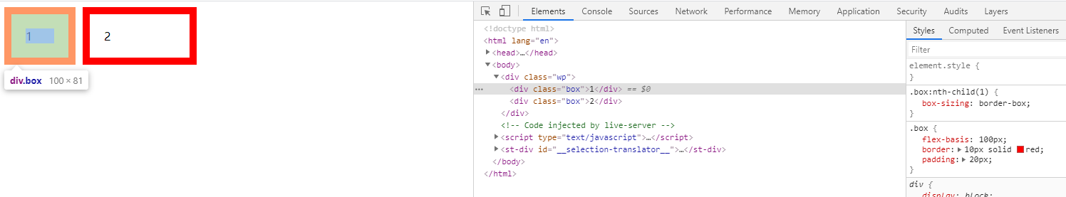
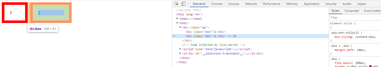
flex-basis 和 box-sizing
- 注意
flex-basis会受box-sizing影响flex-basis指定的尺寸,其实是box-sizing设置的盒子尺寸
- 例子
1 | <!DOCTYPE html> |
- 可以看到同样的
padding、border最后得出的尺寸不一样 - 第一个盒子
flex-basis指定的是border-box的尺寸- box-sizing-1.png
- 第二个盒子
flex-basis指定的是content-box的尺寸- box-sizing-2.png
小结
flex-basis决定了flex-item的初始尺寸flex-basis设置的是box-sizing指定的盒子尺寸- 而初始尺寸又决定了正负向空间,进而影响
flex-grow、flex-shrink的表现 - 当
flex-basis为auto时,取width值为初始尺寸 - 否则用
flex-basis指定的值做为初始尺寸 - 最终展示的尺寸会受
min|max-width限制
flex-grow
- 正向空间的分配
- 存在正向空间时,则需要将空间按策略分配给每个
flex-item - 也就是按照一个放大策略将剩余空间分配给每个
flex-item - 决定如何放大的关键属性就是
flex-grow
- 存在正向空间时,则需要将空间按策略分配给每个
- 默认值为
0,即不放大
放大算法
flex-grow只能取正值- 它代表的是一个拉伸(放大)因子
- 可以理解为一个比例(权重),代表有多少正向空间的分配权利
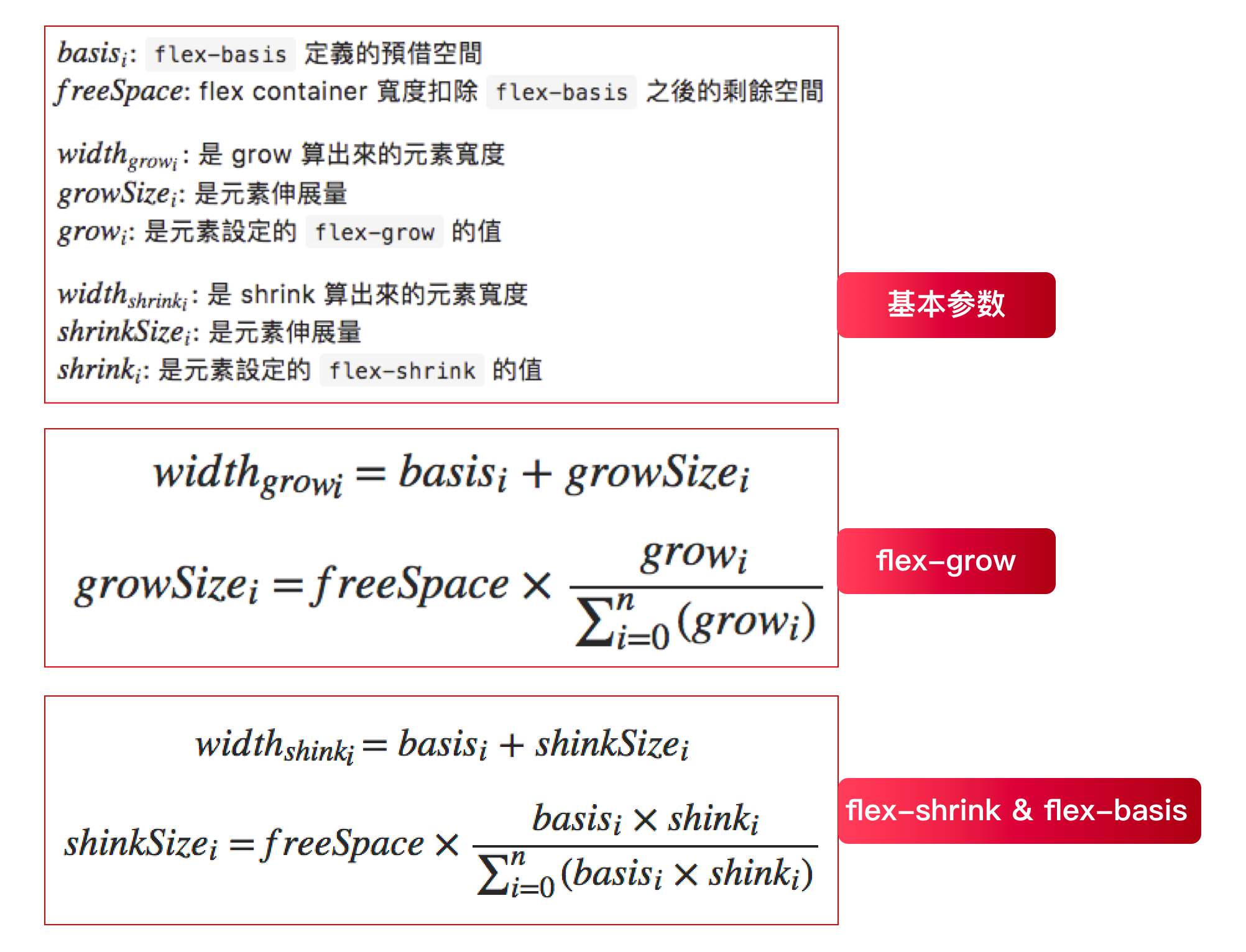
- 算法公式
最终尺寸=初始尺寸 + 分配比例*正向空间大小分配比例=当前flex-item的拉伸因子/所有flex-item的拉伸因子之和- 注意
- 所有
flex-item的拉伸因子之和 最小值为 1,即如果拉伸因子之和小于 1,也会取 1 参与计算 - 这会导致出现正向空间没有被全部分配的场景,具体见第二个例子
- 所有
- 注意
- 比如正向空间为
x,三个元素的flex-grow分别为a,b,c。设sum 为 a + b + c。那么三个元素将得到的正向空间分别是x * a / sum,x * b / sum,x * c / sum,最终尺寸为初始尺寸加上+获得的正向空间
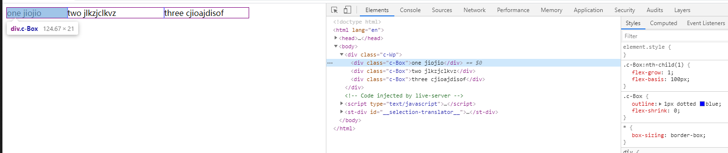
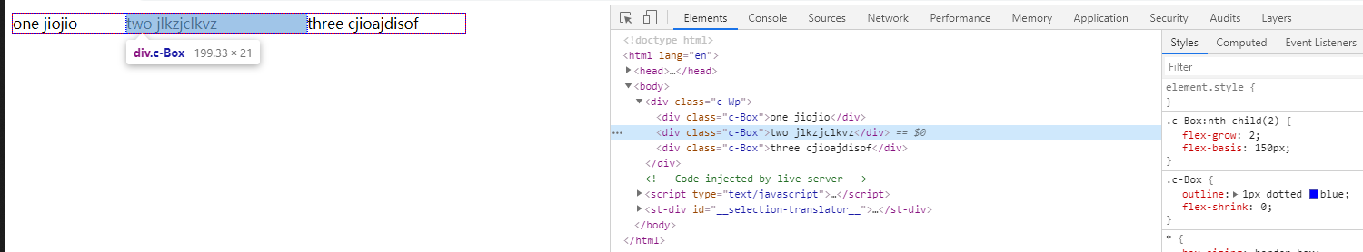
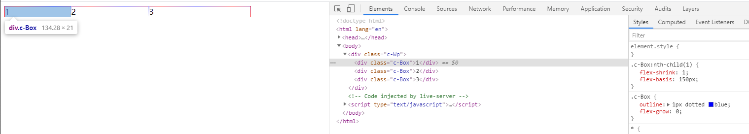
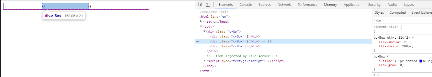
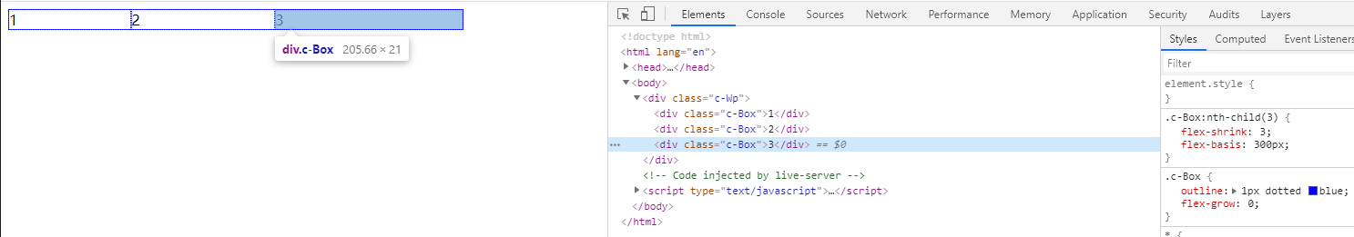
例子 1,拉伸因子之和>=1
1 | <!DOCTYPE html> |
- 可以看到
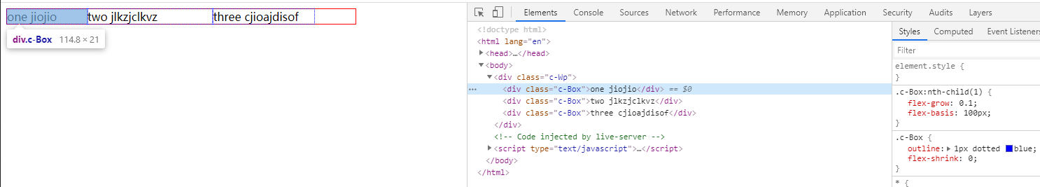
flex container尺寸为500px - 三个
flex item的初始尺寸分别为100px、150px、100px,所以剩余500-350=150的正向空间 - 三个
flex item分别设置了1、2、3的拉伸因子(权重) - 我们记
sum=1 + 2 + 3 = 6为权重总和,所以每个flex-item的分配比例也就可以计算出来 - 第一个盒子
1/sum即1/6,即150 * 1/6 = 25- 所以最终尺寸为
100(初始尺寸) + 25(正向空间)=125 - grow-over-1.png
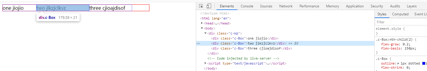
- 第二个盒子
2/sum即2/6,即150 * 1/6 = 50- 所以最终尺寸为
150(初始尺寸) + 50(正向空间)=200 - grow-over-2.png
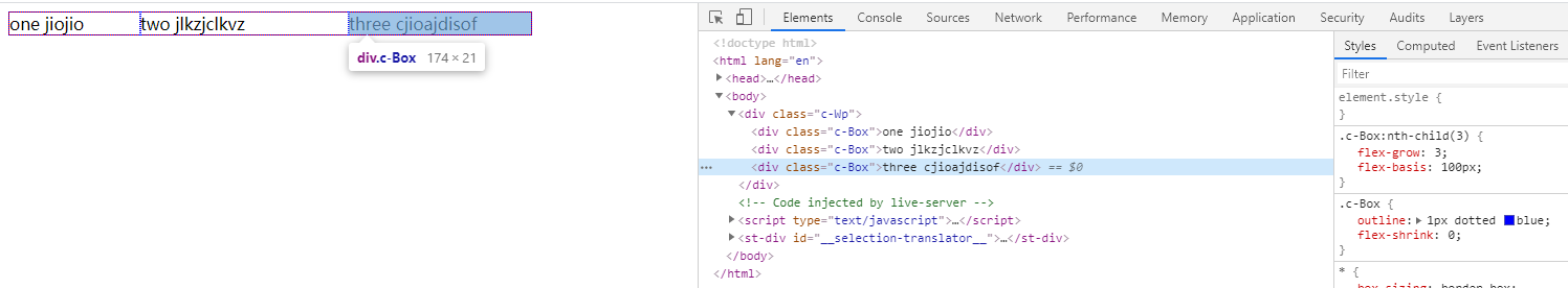
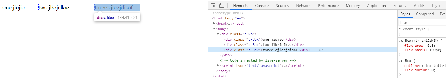
- 第一个盒子
3/sum即3/6,即150 * 1/6 = 75- 所以最终尺寸为
100(初始尺寸) + 75(正向空间)=175 - grow-over-3.png
例子 2,拉伸因子之和<1
1 | <!DOCTYPE html> |
- 可以看到
sum= 0.1 + 0.2 + 0.3 = 0.6 < 1,所以最终取1参与计算 - 第一个盒子
- 最终尺寸:
100(初始尺寸) +0.1/1 * 150 = 115 - grow-less-1.png
- 最终尺寸:
- 第二个盒子
- 最终尺寸:
150(初始尺寸) +0.2/1 * 150 = 180 - grow-less-2.png
- 最终尺寸:
- 第三个盒子
- 最终尺寸:
100(初始尺寸) +0.3/1 * 150 = 145 - grow-less-3.png
- 最终尺寸:
- 可以看到最后还有
500 -115 - 180 - 145 = 60的尺寸没有分配
等分布局
- 如何实现自适应等分布局?
- 所有
flex item的flex-basis设置为0和flex-grow设置为相同值(总和>1)即可
- 所有
- 原理
flex-basis:0代表初始尺寸为 0,当所有flex item的初始尺寸都为 0,那计算出来的正向空间就为flex container的尺寸flex-grow设置为相同值并且总和>1,代表平均分配所有正向空间,由于初始尺寸为 0,所有flex item得到的正向空间又相同,所以就实现了等分布局
- 例子
1 | <!DOCTYPE html> |
- average.png
flex-shrink
- 负向空间的分配
- 存在负向空间时,需要按照缩小算法收缩每个
flex-item
- 存在负向空间时,需要按照缩小算法收缩每个
- 默认值为
0,即不缩小
缩小算法
- 和放大算法不同,缩小算法在计算每个
flex item的收缩大小时,不仅需要考虑收缩因子(flex-shrink指定的值),还需要考虑item的初始尺寸 - 具体算法
- 总权重 TW = 每个(
item的flex-shrink*item的初始尺寸)之和 - 当前
item需要缩小的尺寸= 负向空间 _ ((当前 item 的flex-shrink_ 初始尺寸) / 总权重 TW) - 最终尺寸 = 当前
item初始尺寸+ 需要缩小尺寸 (因为负向空间尺寸为负值,所以此处为加号)
- 总权重 TW = 每个(
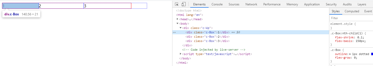
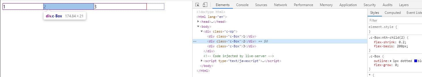
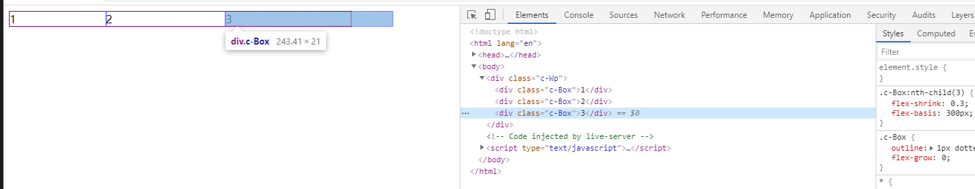
例子 1,缩小因子之和>=1
1 | <!DOCTYPE html> |
- 负向空间 =
500 - 150 - 200 - 300 = -150 - 计算总权重 TW =
1 * 150 + 2 * 200 + 3 * 300 = 1450 - 第一个盒子
- 最终尺寸=
150 + (-150负向空间 * ((1*150) / 1450)) = 134.5 - shrink-over-1.png
- 最终尺寸=
- 第二个盒子
- 最终尺寸=
200 + (-150负向空间 * ((2*200) / 1450)) = 158.6 - shrink-over-2.png
- 最终尺寸=
- 第三个盒子
- 最终尺寸=
300 + (-150负向空间 * ((3*300) / 1450)) = 206.9 - shrink-over-3.png
- 最终尺寸=
例子 2,缩小因子之和<1
- 当缩放因子之和<1 时,只有缩放因子之和* 负向空间的空间会参与收缩
- 例如 , 缩放因子分别为
0.1、0.2、0.3,总和<1,负向空间的尺寸为 150,那么只有 90 的空间会被缩小
- 例如 , 缩放因子分别为
- 例子(将例子 1 的缩放因子设置为缩小十倍)
1 | <!DOCTYPE html> |
- 负向空间 =
500 - 150 - 200 - 300 = -150 - 计算总权重 TW =
0.1* 150 + 0.2 * 200 + 0.3 * 300 = 145 - 第一个盒子
- 最终尺寸=
150 + (-150负向空间 * (0.1 + 0.2 + 0.3) * ((0.1*150) / 145)) = 140.69 - shrink-less-1.png
- 最终尺寸=
- 第二个盒子
- 最终尺寸=
200 + (-150负向空间 * (0.1 + 0.2 + 0.3) * ((0.2*200) / 145)) = 175.17 - shrink-less-2.png
- 最终尺寸=
- 第三个盒子
- 最终尺寸=
300 + (-150负向空间 * (0.1 + 0.2 + 0.3) * ((0.3*300) / 145)) = 244.14 - shrink-less-3.png
- 最终尺寸=
- 可以看到还有
60px溢出了(没有被收缩)
小结
- 放大和缩小的算法不太一样,缩小算法需要考虑初始尺寸
- 总结公式如下
- sumary.png
简写属性
flex
flex是上述三者的简写- 其默认值为
flex: 0 1 auto; - 三个值依次代表
flex-grow、flex-shrink、flex-basis - 0 代表不放大
- 1 代表不缩小
- auto 代表使用 width 值做为初始尺寸
- 其默认值为
- 由于默认值为
0 1 auto,所以在某些特定场景,会出现问题,所以建议在任何场景都显示指明flex的三个属性值
常用缩写
flex:1- 等同
flex: 1 1 0;
- 等同
flex:0- 等同
flex: 0 1 0;
- 等同
flex:auto- 等同
flex: 1 1 auto;
- 等同
flex 应用
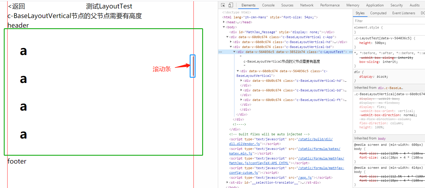
移动端常见,头尾固定,中间局部滚动布局
1 | <template> |
- apply.png
- 同理水平方向,我们也可以实现常见的
双飞翼、圣杯布局 - 具体可参考下面连接
总结
确定 flex item 尺寸的步骤
- 首先确定初始尺寸
flex-basis、width决定flex-basis为auto时,取width值,若未显示指定width值,则取max-content- 非
auto时,直接取对应值的计算值为初始尺寸
- 确定空间类型
- 初始尺寸之和 >
flex container尺寸时存在负向空间- 负向空间大小 = 初始尺寸之和 -
flex container尺寸
- 负向空间大小 = 初始尺寸之和 -
- 初始尺寸之和 <
flex container尺寸时存在正向空间- 正向空间大小 =
flex container尺寸 - 初始尺寸之和
- 正向空间大小 =
- 初始尺寸之和 >
- 根据空间类型决定使用
flex-grow、flex-shrink策略来分配空间,得到展示大小- 正向空间直接按拉伸因子(
flex-grow申明的)所占比例来分配 - 负向空间收缩不光要考虑收缩因子,还需要考虑到初始尺寸
- 正向空间直接按拉伸因子(
- 展示大小受
min|max-width|height的限制
参考
- https://developer.mozilla.org/zh-CN/docs/Web/CSS/flex-basis
- https://developer.mozilla.org/zh-CN/docs/Web/CSS/CSS_Flexible_Box_Layout/Controlling_Ratios_of_Flex_Items_Along_the_Main_Ax
- https://www.zhangxinxu.com/wordpress/2019/12/css-flex-basis/
- https://www.zhangxinxu.com/wordpress/2019/12/css-flex-deep/
- https://github.com/xieranmaya/blog/issues/9
- https://www.cnblogs.com/yunqishequ/p/10006872.html